Design Case Studies
Other Projects
Southwest Airlines
Redesigning the flight search experience to make it more exploratory and user-friendly
Grad School
Visual Design
UX Design
Southwest Airlines
Redesigning the flight search experience to make it more exploratory and user-friendly
Grad School
Visual Design
UX Design
Time Frame
3 Months
Overview
For our UX Class at CU Boulder, we were given the project to redesign the experience of a company. I chose Southwest Airlines due to the tedious and unsatisfying experience of booking flights on their website. My aim was to design a site that offered an improved user experience, had improved aesthetics, and made booking flights easier.
Highlights
Conducted thorough research about Southwest and their competitors to inform the design process.
Interviewed friends, family, and classmates to understand their experiences with Southwest and identify areas for improvement.
Created medium-fidelity wireframes for user testing and iterative design.
Developed visual designs based on user feedback and created a marketing plan to promote the new features.


Mission
Connect People to what’s important in their lives through friendly, reliable, and low-cost air travel.
Connect People to what’s important in their lives through friendly, reliable, and low-cost air travel.
Assumption
Southwest is not investing enough in their digital user experience and therefore losing credibility.
By making it hard to explore destinations and find low-cost tickets in a user friendly manner, Southwest is losing their credibility and market share
#3
Domestic Market Share
Domestic Market Share
#3
Customer Satisfaction
Customer Satisfaction
#4
App Store ranking among other domestic airlines
User Personas
I interviewed friends and colleagues about features they would like in a flight booking app. I tried to consolidate my findings by creating two different personas.

User Stories
The key features identified are:
Select a flexible time period for travel
Easily explore travel destinations and find the cheapest options
Explore destinations based on interests like hiking, skiing, beaches, etc
Curated travel recommendations and personalized deals
After the initial research, these were the conclusions that were drawn up:
Jobs to be Done
Provide an easier and more flexible way to explore and book travel destinations based on the user’s interests and price range.
Thesis
Redesigning the flight search page to make it more exploratory and user friendly would make Southwest the market leader in customer satisfaction and sales.
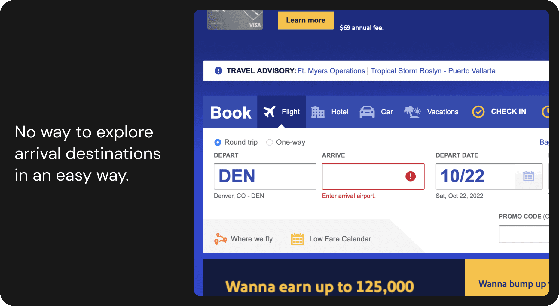
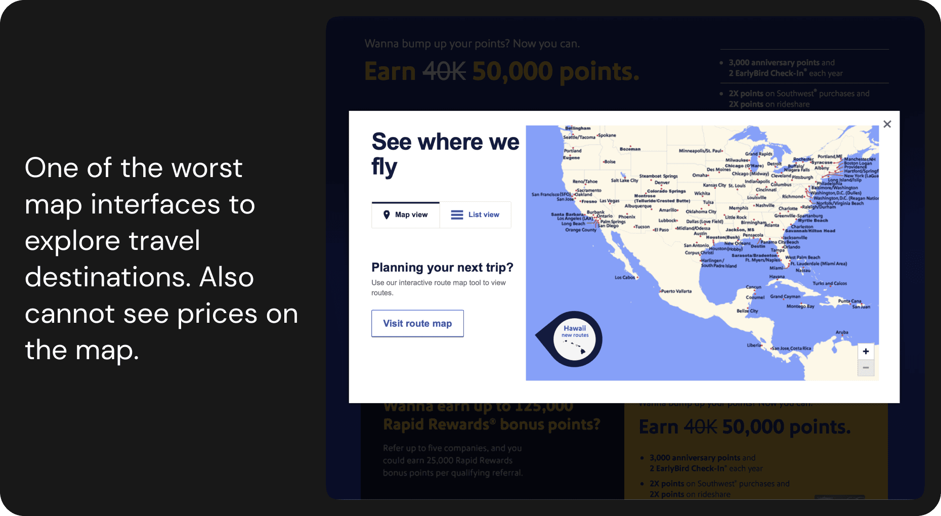
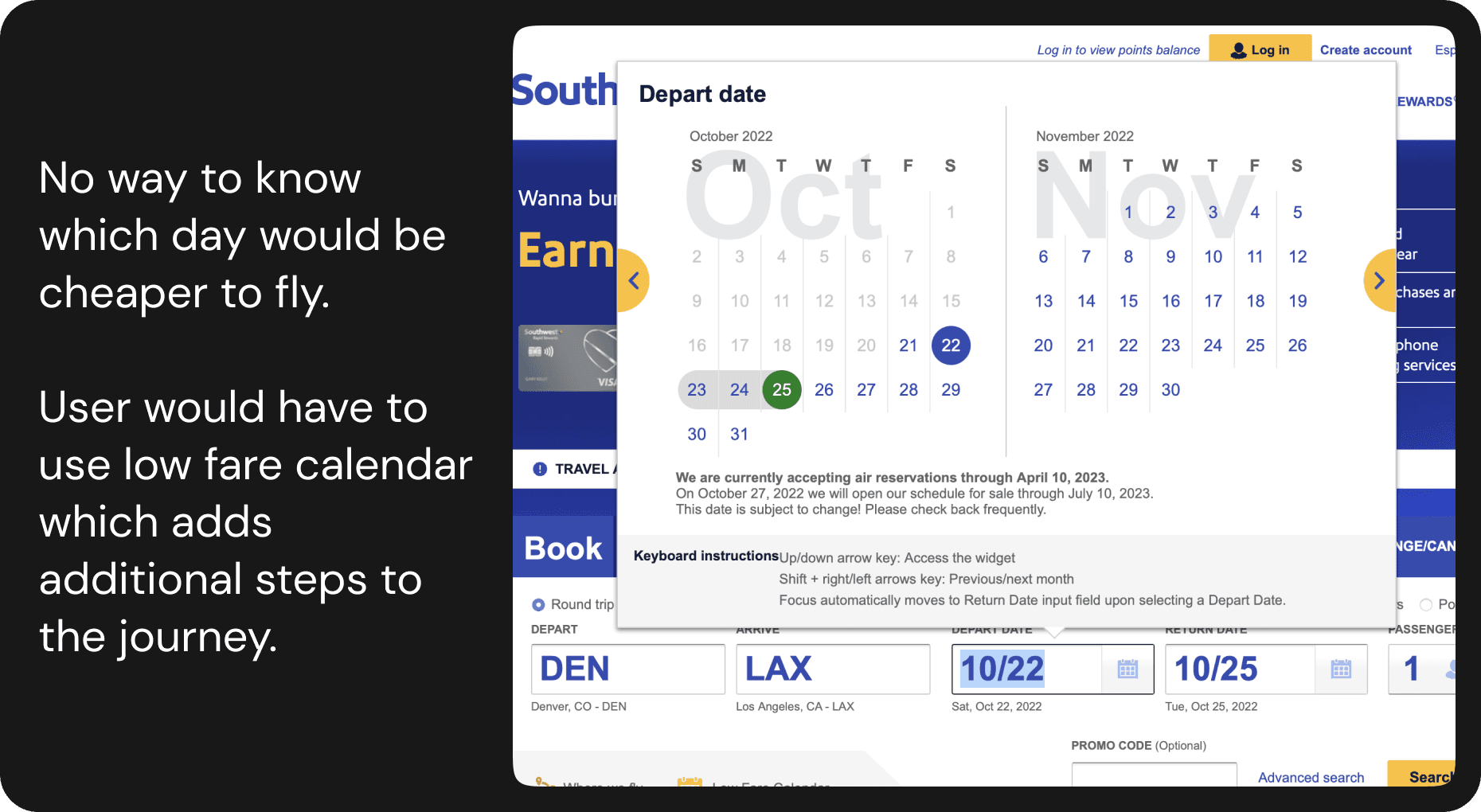
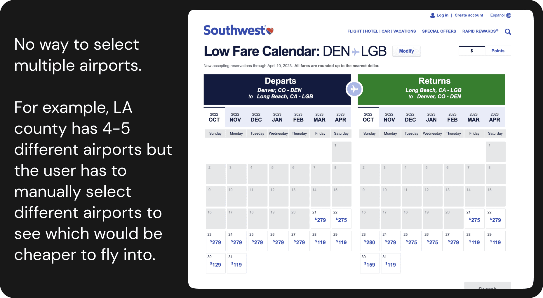
Existing Design Issues
The Redesign
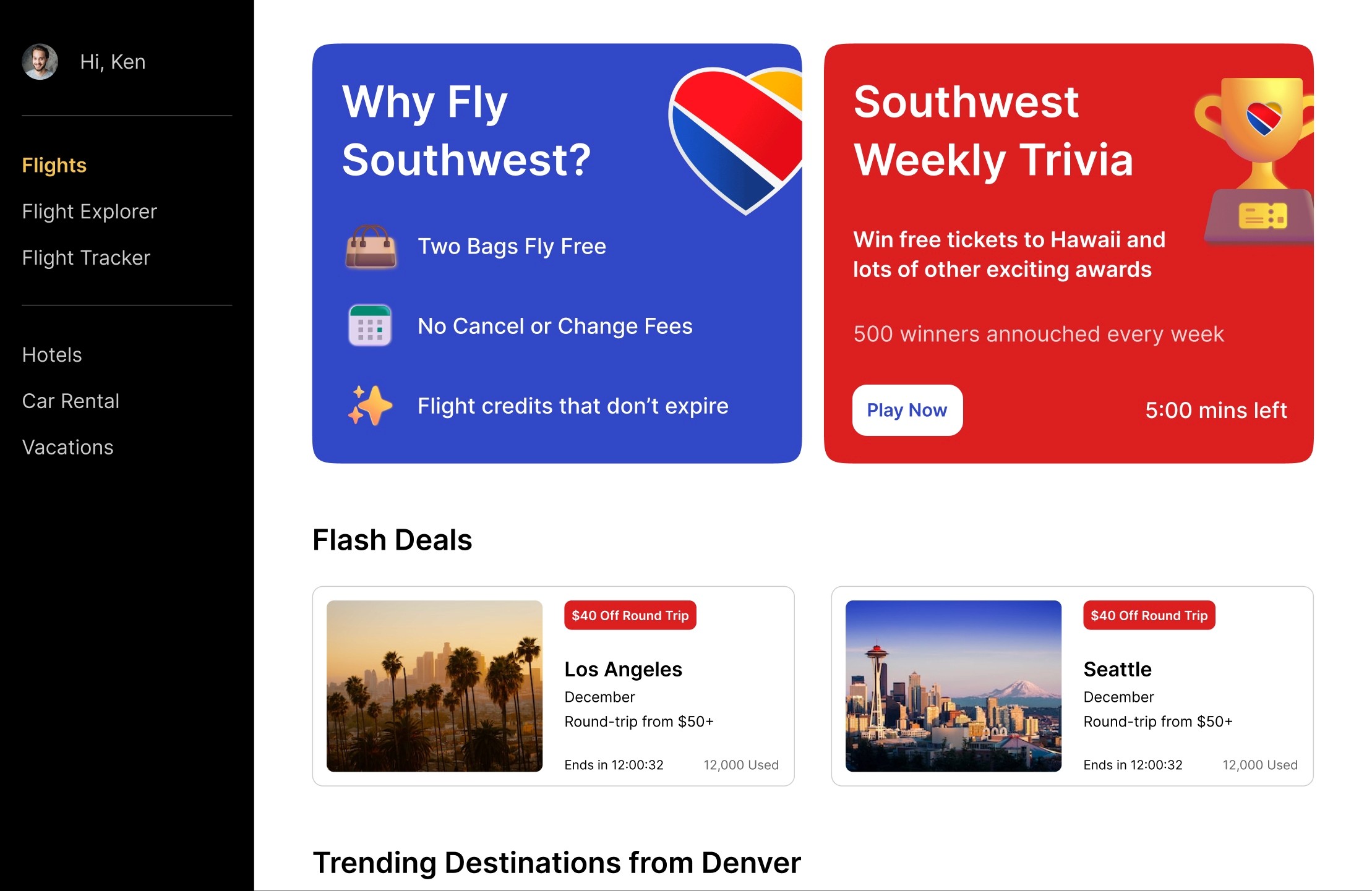
Flash Deals
Great travel deals that are only valid for 12 hours on the home page. The user will also get a limited-time discount on car rentals and hotels after the user books a flight. Research shows that deals for a limited duration increase the likelihood of participation.
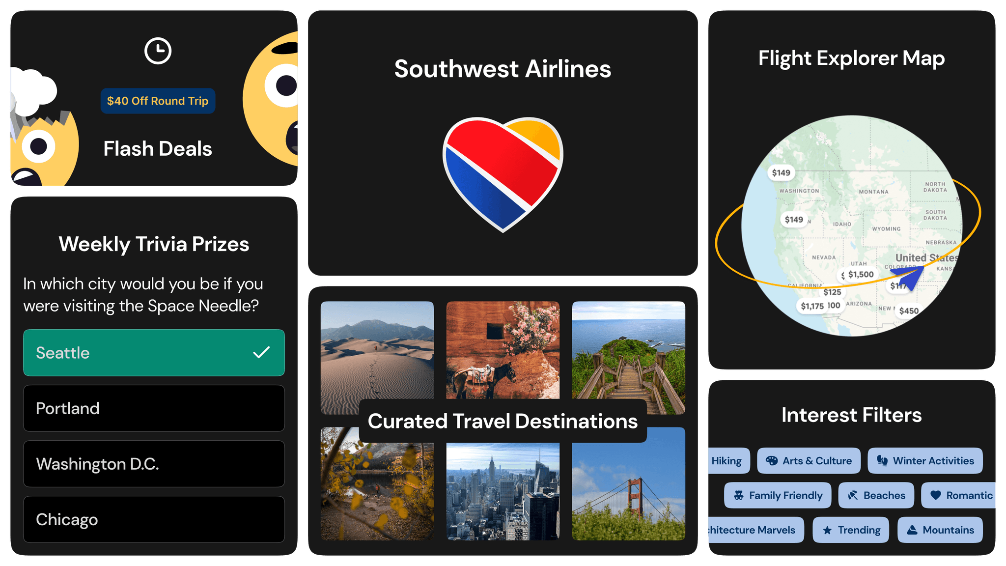
Curated Recommendations
Curated travel destinations based on interests, seasons, festivals, and past purchases.
Date Selector with Price Insight
See which days in the month would be cheaper to fly when looking at specific dates and make travel plans based on that insight.
Flexible Date Selector
Let the system figure out the best days to fly by providing information about your travel length and the months you want to fly.
Flight Explorer
Not sure where to travel? You can go on the flight explorer page and find destinations based on your budget, interests, and duration.
Map View
A much more interactive way to look at flight options, you can see destinations along with their estimated prices.

Gamifying the Experience
As an enthusiastic fan of trivia, I am excited to propose a Weekly Trivia contest with rewards for the 500 best-performing contestants! Each membership tier would have its own set of questions, and higher-tier members would receive larger rewards.
This would not only captivate the audience, boost their intellectual capabilities, and provide a unique reward system - it would also increase Southwest's exposure and bookings!
Marketing the feature
Suggest Southwest to sponsor a Jeopardy episode and feature a category about travel. As part of this unique partnership, viewers will be treated to a trivia contest presented during the commercial break.
User Feedback
I conducted user testing with five different people, and these were some of the feedback I received
“This is way more convenient than the current southwest website. Trying to find cheap flights on Southwest is really hard, but with flexible travel and explore features, this will be so convenient.”
“I love the flash deals and the trivia idea. I hope there’s a way to get notified about it on my phone.”
“The curation feature is pretty cool. Southwest can collaborate with influencers/celebrities to promote this feature and add their travel guides on the website.”
“I liked your killer feature idea, but I didn't even notice it. Maybe have it animated or make it more prominent.”
Iteration
The last comment provided me with the insight to make the trivia feature more prominent.
Before

After

Reflections
Working on this project has helped me to critique existing designs more effectively.
This project also made me understand the importance of gamification and how it can used positively to keep the users engaged.
I had to think of a marketing plan to launch the redesign, which was an enjoyable exercise to help the project stand out.
Time Frame
3 Months
Overview
For our UX Class at CU Boulder, we were given the project to redesign the experience of a company. I chose Southwest Airlines due to the tedious and unsatisfying experience of booking flights on their website. My aim was to design a site that offered an improved user experience, had improved aesthetics, and made booking flights easier.
Highlights
Conducted thorough research about Southwest and their competitors to inform the design process.
Interviewed friends, family, and classmates to understand their experiences with Southwest and identify areas for improvement.
Created medium-fidelity wireframes for user testing and iterative design.
Developed visual designs based on user feedback and created a marketing plan to promote the new features.


Mission
Connect People to what’s important in their lives through friendly, reliable, and low-cost air travel.
Assumption
Southwest is not investing enough in their digital user experience and therefore losing credibility.
By making it hard to explore destinations and find low-cost tickets in a user friendly manner, Southwest is losing their credibility and market share
#3
Domestic Market Share
#3
Customer Satisfaction
#4
App Store ranking among other domestic airlines
User Personas
I interviewed friends and colleagues about features they would like in a flight booking app. I tried to consolidate my findings by creating two different personas.

User Stories
The key features identified are:
Select a flexible time period for travel
Easily explore travel destinations and find the cheapest options
Explore destinations based on interests like hiking, skiing, beaches, etc
Curated travel recommendations and personalized deals
After the initial research, these were the conclusions that were drawn up:
Jobs to be Done
Provide an easier and more flexible way to explore and book travel destinations based on the user’s interests and price range.
Thesis
Redesigning the flight search page to make it more exploratory and user friendly would make Southwest the market leader in customer satisfaction and sales.
Existing Design Issues


The Redesign
Flash Deals
Great travel deals that are only valid for 12 hours on the home page. The user will also get a limited-time discount on car rentals and hotels after the user books a flight. Research shows that deals for a limited duration increase the likelihood of participation.
Curated Recommendations
Curated travel destinations based on interests, seasons, festivals, and past purchases.
Date Selector with Price Insight
See which days in the month would be cheaper to fly when looking at specific dates and make travel plans based on that insight.
Flexible Date Selector
Let the system figure out the best days to fly by providing information about your travel length and the months you want to fly.
Flight Explorer
Not sure where to travel? You can go on the flight explorer page and find destinations based on your budget, interests, and duration.
Map View
A much more interactive way to look at flight options, you can see destinations along with their estimated prices.

Gamifying the Experience
As an enthusiastic fan of trivia, I am excited to propose a Weekly Trivia contest with rewards for the 500 best-performing contestants! Each membership tier would have its own set of questions, and higher-tier members would receive larger rewards.
This would not only captivate the audience, boost their intellectual capabilities, and provide a unique reward system - it would also increase Southwest's exposure and bookings!

Marketing the feature
Suggest Southwest to sponsor a Jeopardy episode and feature a category about travel. As part of this unique partnership, viewers will be treated to a trivia contest presented during the commercial break.
User Feedback
I conducted user testing with five different people, and these were some of the feedback I received
“This is way more convenient than the current southwest website. Trying to find cheap flights on Southwest is really hard, but with flexible travel and explore features, this will be so convenient.”
“I love the flash deals and the trivia idea. I hope there’s a way to get notified about it on my phone.”
“The curation feature is pretty cool. Southwest can collaborate with influencers/celebrities to promote this feature and add their travel guides on the website.”
“I liked your killer feature idea, but I didn't even notice it. Maybe have it animated or make it more prominent.”
Iteration
The last comment provided me with the insight to make the trivia feature more prominent.
Before

After


Reflections
Working on this project has helped me to critique existing designs more effectively.
This project also made me understand the importance of gamification and how it can used positively to keep the users engaged.
I had to think of a marketing plan to launch the redesign, which was an enjoyable exercise to help the project stand out.
Southwest Airlines


